Article
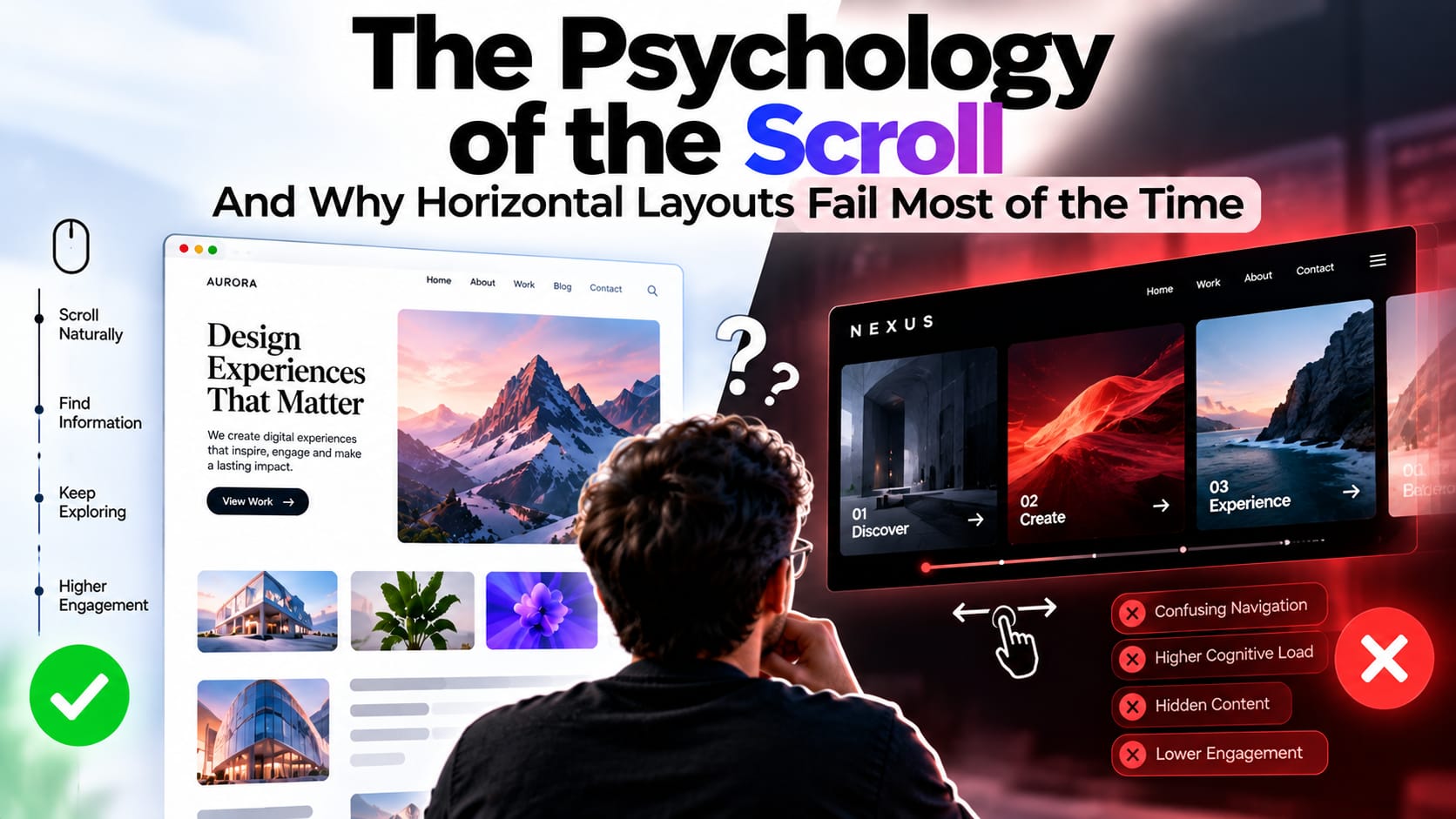
Do you want to know what makes any website worthy of scrolling or makes the browsing experience better for users? Web navigation relies on deeply ingrained muscle memory, and users need something that's worthy of browsing. For centuries, users have scrolled everything vertically, but now downward motion is the new trend. Many design studios are breaking this notion by adding horizontal scrolling that looks better on paper but often confuses the human mind.
So, do you think standard navigation rules can take you to the crown of the best website or an award-winning site? You can say horizontal scrolling can create a sense of novelty, but they often alienate visitors by distorting their path and killing user engagement. And designers need to understand why horizontal frameworks fail 80% of the time and how the successful 20% can help in capturing global acclaim.
The friction of counterintuitive UI
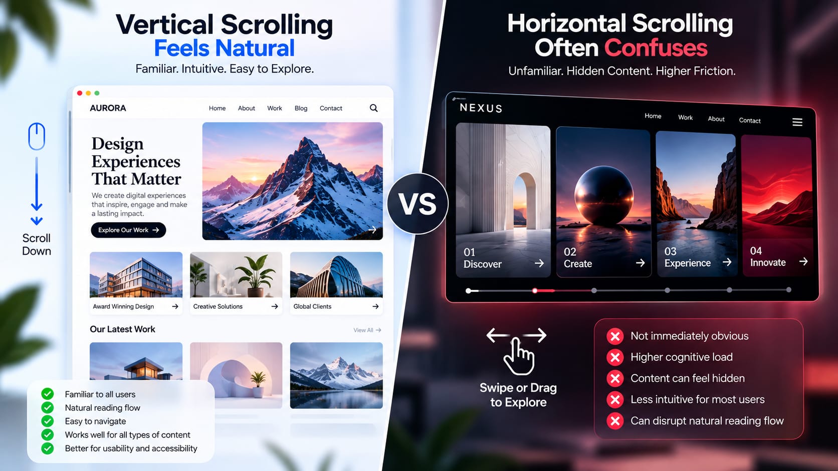
The main reason why horizontal scrolling doesn't work is because of cognitive load. When a normal user browses any webpage, they don't expect a sudden change or want someone to force them to scroll sideways and cause immediate friction. Horizontal elements are often perceived as static, which hides the content. Furthermore, standard cursors are built for vertical scrolling, making sideways work clumsy with forced trackpad gestures or without any on-screen drag indicators.
The problem with content hierarchy
With the use of standard navigation, designers can include text layouts, grid systems, and logical reading patterns. Whereas, in horizontal scrolling, this flips the structure, making the long-form content difficult to read. Scanning columns from left to right in a horizontal pattern strains the eye and disrupts natural flow. This layout would work horribly for information-heavy websites, corporate landing pages, and even for e-commerce checkouts where clarity is the priority. And if content hierarchy is compromised by visual surprise, then usability can suffer significantly.
Where Sideways Navigation Actually Works
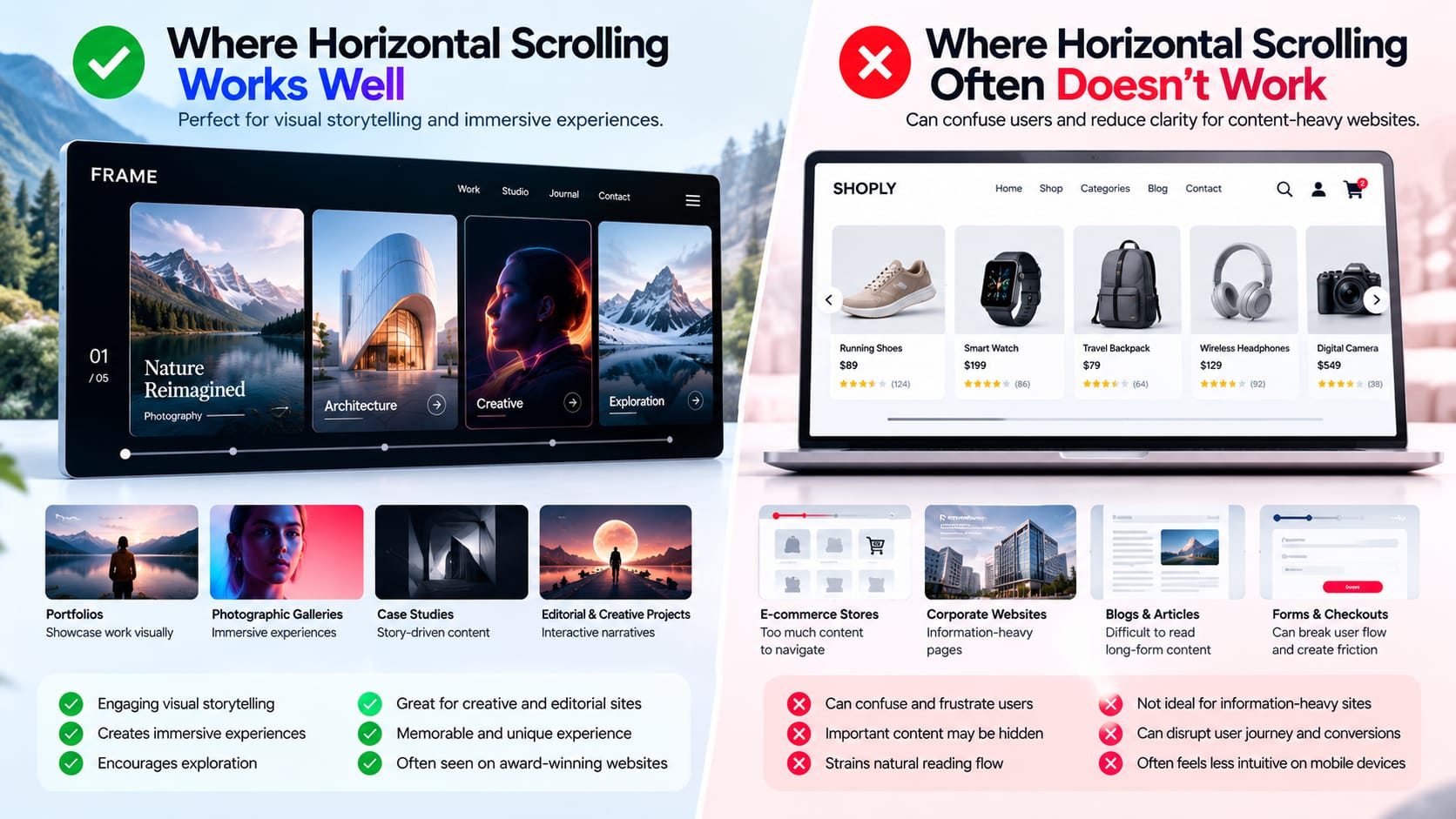
Despite the 80% failure rate, the remaining 20% of horizontal layouts have gained massive popularity and have been used across many award-winning websites. These successful projects are popular because they use horizontal landscape for visual storytelling. Horizontal scrolling can work well for portfolios, photographic galleries, immersive case studies, and sequential narratives rather than e-commerce platforms. The designers should think about how the website will behave more like an editorial art magazine or an interactive film rather than a standard mobile application.
Rules for flawless horizontal execution
If you decide to work on a horizontal layout, make sure to follow strict usability rules to ensure you don't make the browsing experience worse.
- Provide clear visual cues—make sure never to confuse your users and surprise them abruptly. Add progress bars, floating directional arrows, and clear text that states "scroll or drag.”
- Add multi-device gestures—designers should ensure vertical mouse-wheel input and trackpad gestures are handled intuitively and provide horizontal movement across all browsers.
Conclusion
Hence, not following traditional web conventions is a massive gamble that can enhance or ruin the user's browsing experience. In order to become part of an award-winning site, you need a flawless understanding of human psychology. True digital creators never force users to learn new ways of navigation. They allow users to be curious and let the design be effortless. Horizontal scrolling should serve the narrative and not let users abandon it.